About Monotopo
Built to make geography feel personal.
The project bridges precise city data and the visual restraint of a good print. It exists for people who want the exact place to matter and the final object to belong in a real room.
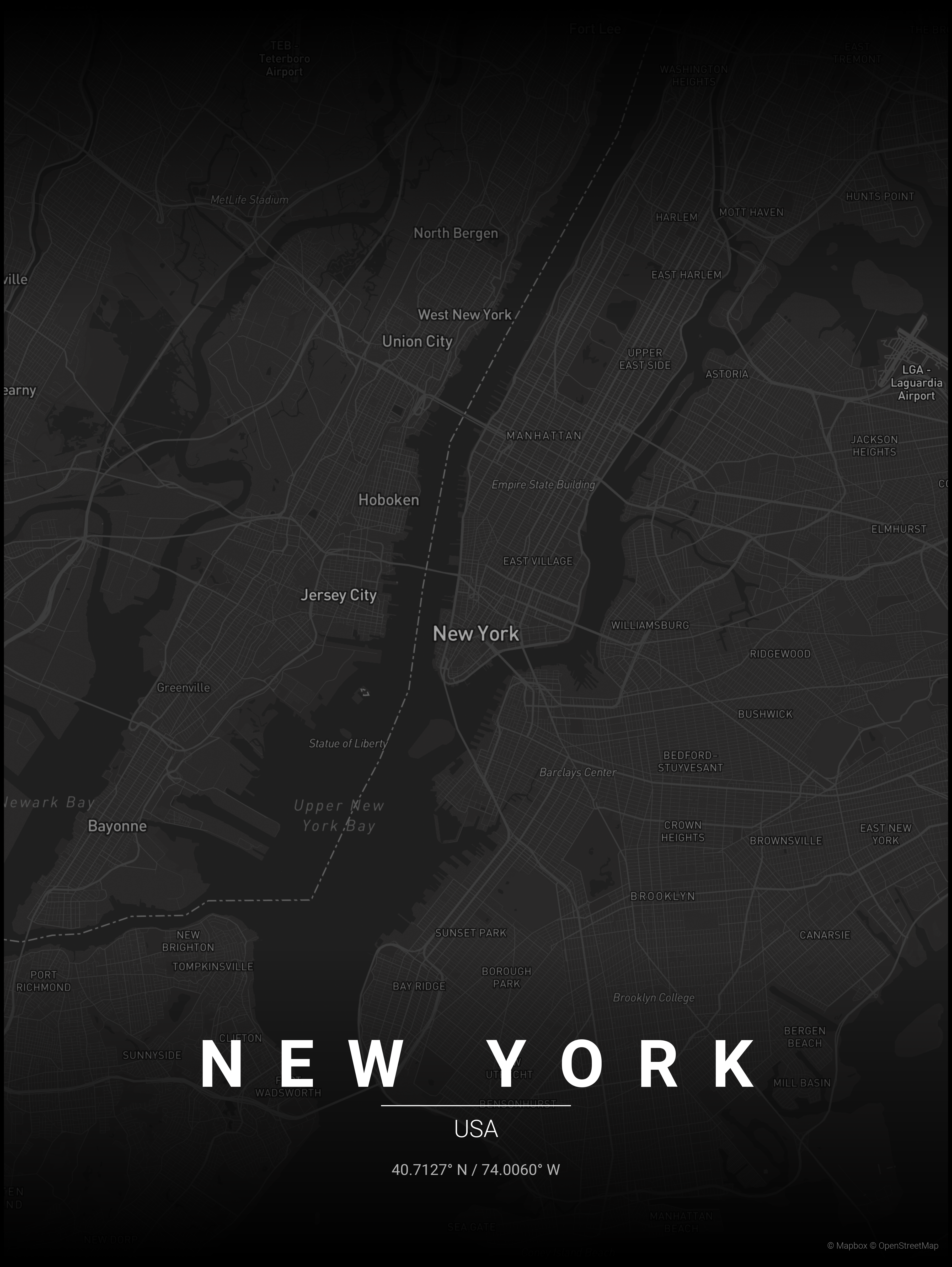
Workflow
How the maps move from raw geography to something worth framing.
- 01
Open data in
The process starts with OpenStreetMap geometry so roads, waterways, and parks stay geographically honest.
- 02
Rendering logic
The backend filters and prioritizes linework, balances density, and applies visual hierarchy before any palette is introduced.
- 03
Poster output
Themes, typography, and export settings finish the piece so it reads as an object for the wall rather than a raw map export.
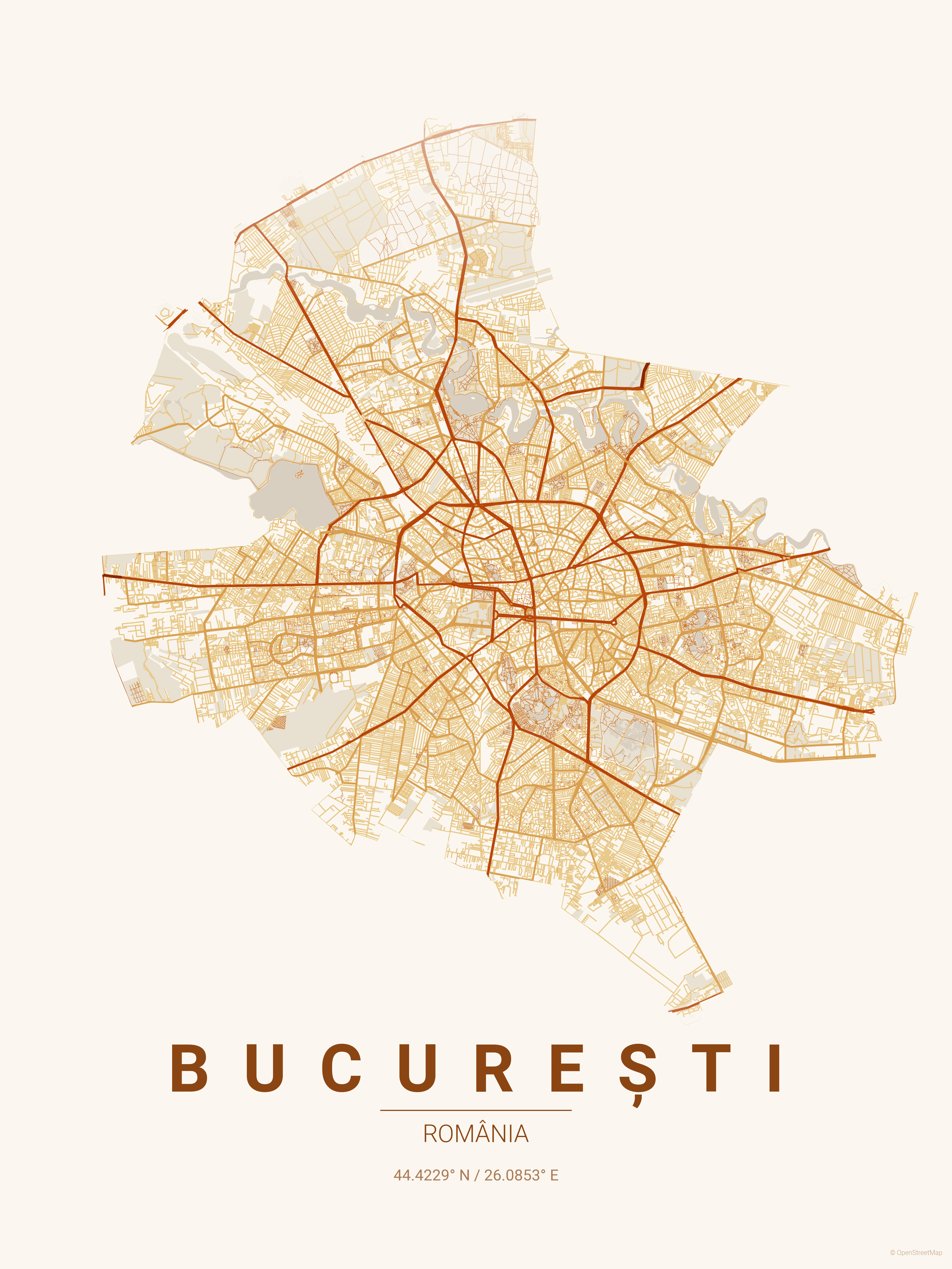
Craft
The goal is clarity, atmosphere, and print quality in the same piece.
A raw map export can be technically correct and still feel unusable as art. This project focuses on the balance between legibility, restraint, and interior-friendly color direction.
- Data source
- OpenStreetMap for the base geographic structure.
- Map processing
- Python tooling with OSMnx for fetching and shaping the relevant geometry.
- Rendering
- Custom theming and styling logic layered over the geographic primitives.
- Presentation
- Astro on the front end for a lightweight, fast public-facing site.
Project intent
Open data, design restraint, and enough flexibility to make the result yours.
People should be able to trace a place with emotional gravity and render it in a way that still feels visually considered. That balance is what makes the output stick.