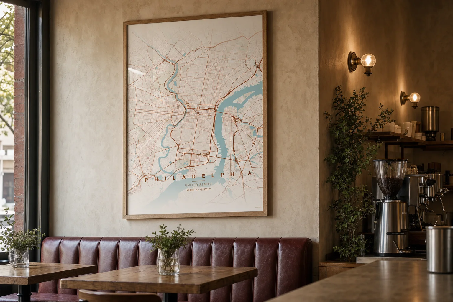
Bottom line: Treat location maps as part of the café’s interior system, not as decoration bought at the end.
Why it works: The city changes from shop to shop while the palette, frame, scale, and placement stay recognizably yours.
Try this: Start with the address where the business began and define one repeatable framing specification before adding another location.
A good café wall should do more than fill space. It should make the room feel specific: this neighborhood, this corner, this particular morning ritual. A map can carry that identity without turning the interior into a collection of tourist graphics.
The useful idea is not a wall crowded with every city the business hopes to reach. It is a simple system that can grow at the same pace as the company.
Begin with the first address
The first map should be centered on the place that has earned meaning. That may be the original shop, the block where the beans are roasted, or the neighborhood that shaped the menu and regular crowd.
Choose the radius by asking what customers actually recognize. A broad city view creates a strong graphic field. A tighter neighborhood view makes familiar streets, a river bend, or a nearby park easier to find. Neither is automatically better; the right crop is the one that tells the story customers already know.
Make the room and poster share materials
In the Philadelphia café shown above, pale terracotta roads, soft blue water, warm plaster, oak, and oxblood leather belong to the same visual family. The poster is prominent, but it does not feel imported from another project.
Use the room’s fixed materials to choose the map treatment:
- Warm plaster, leather, brick, and walnut can support terracotta or autumn palettes.
- Pale oak, linen, and light stone work well with warm beige or softer monochrome maps.
- Steel, concrete, and dark tile can carry blueprint, noir, or midnight-blue treatments.
The frame should repeat a material already present. An oak frame can echo a banquette or tabletop. A thin black frame can pick up window mullions, lighting, or metal shelving.
Define a rule before opening location two
Write down the choices that make the first piece work: poster size, frame finish, mat width, hanging height, map theme, title treatment, and radius. Those decisions become a small interior standard.
When the next café opens, change the city and keep the rule. The maps will be visibly different because the street networks and waterways are different, but they will still read as one family. That is more convincing than forcing identical artwork into rooms with different floor plans.
A narrow shop may need one large map above a banquette. A wider location may suit two maps at opposite ends of the room. Consistency comes from the specification, not from repeating the exact layout.
Leave space for the next chapter
Do not build an aspirational gallery of locations that do not exist yet. One confident piece is enough. Add the next map when the next place becomes real.
That restraint gives the wall narrative value. Over time, the collection becomes a quiet record of the business: where it started, where it found another audience, and how its visual language traveled with it.
Create the first location map while the framing rule is still easy to define.