Theme library

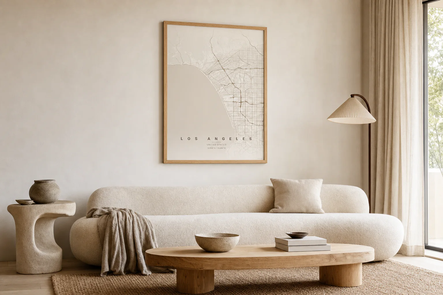
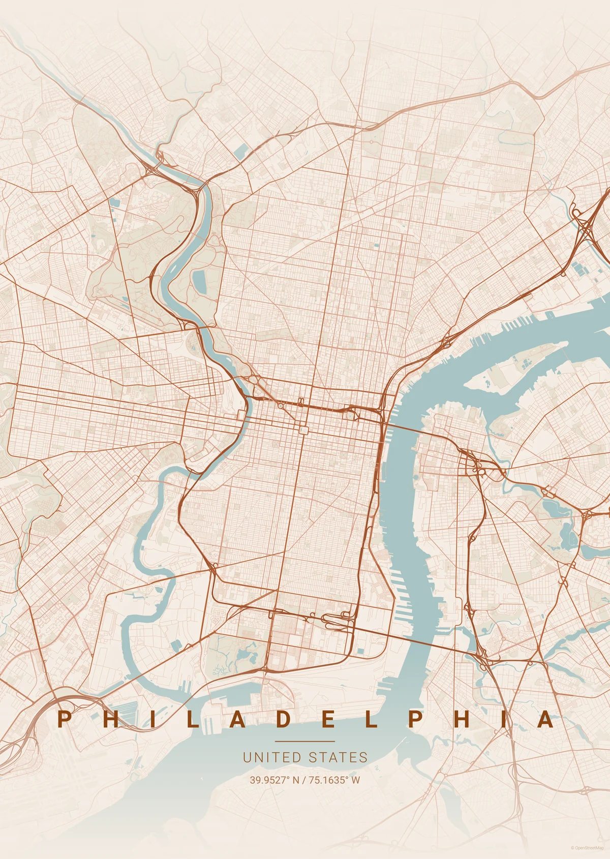
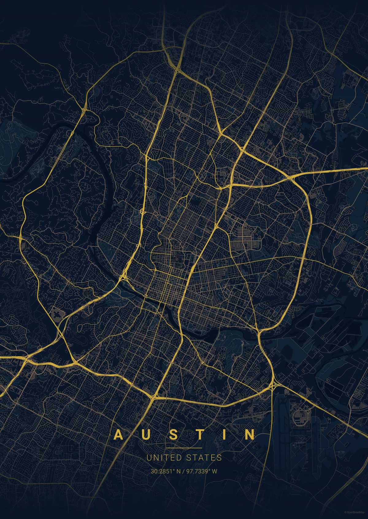
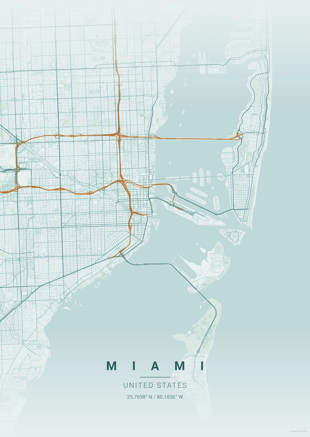
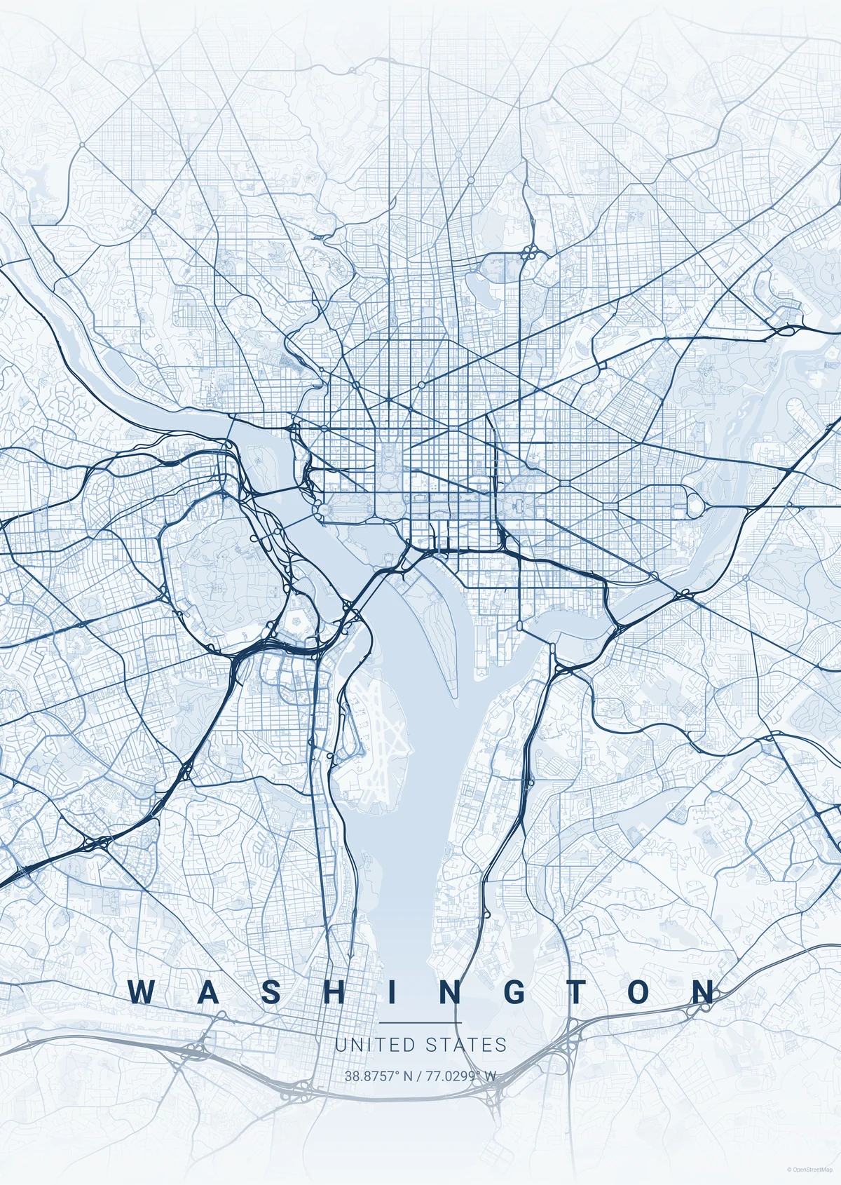
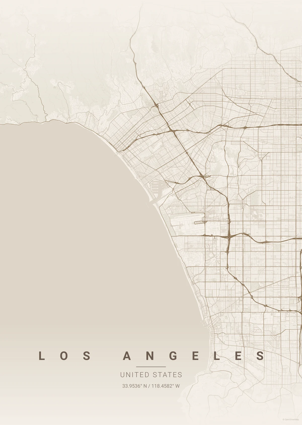
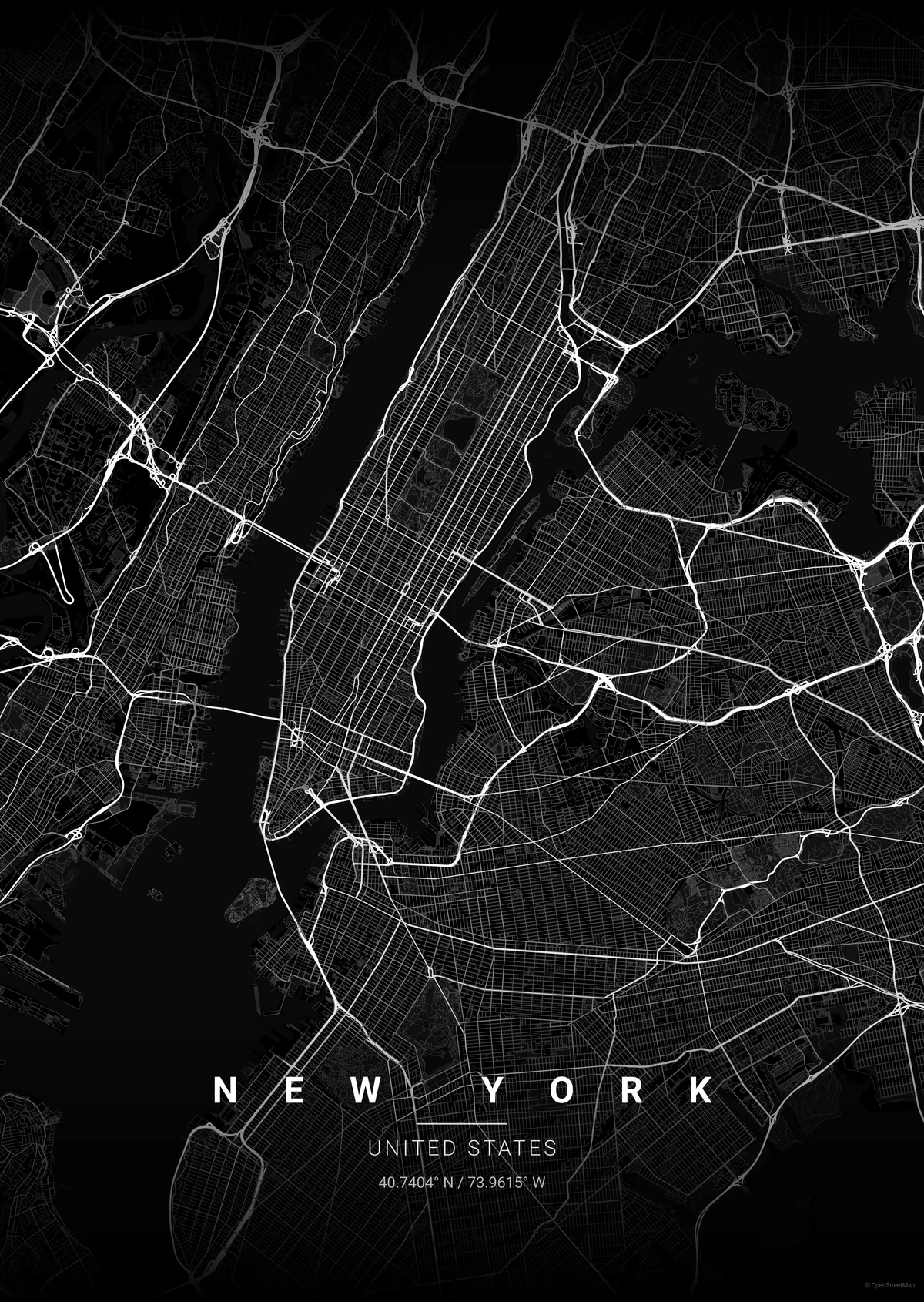
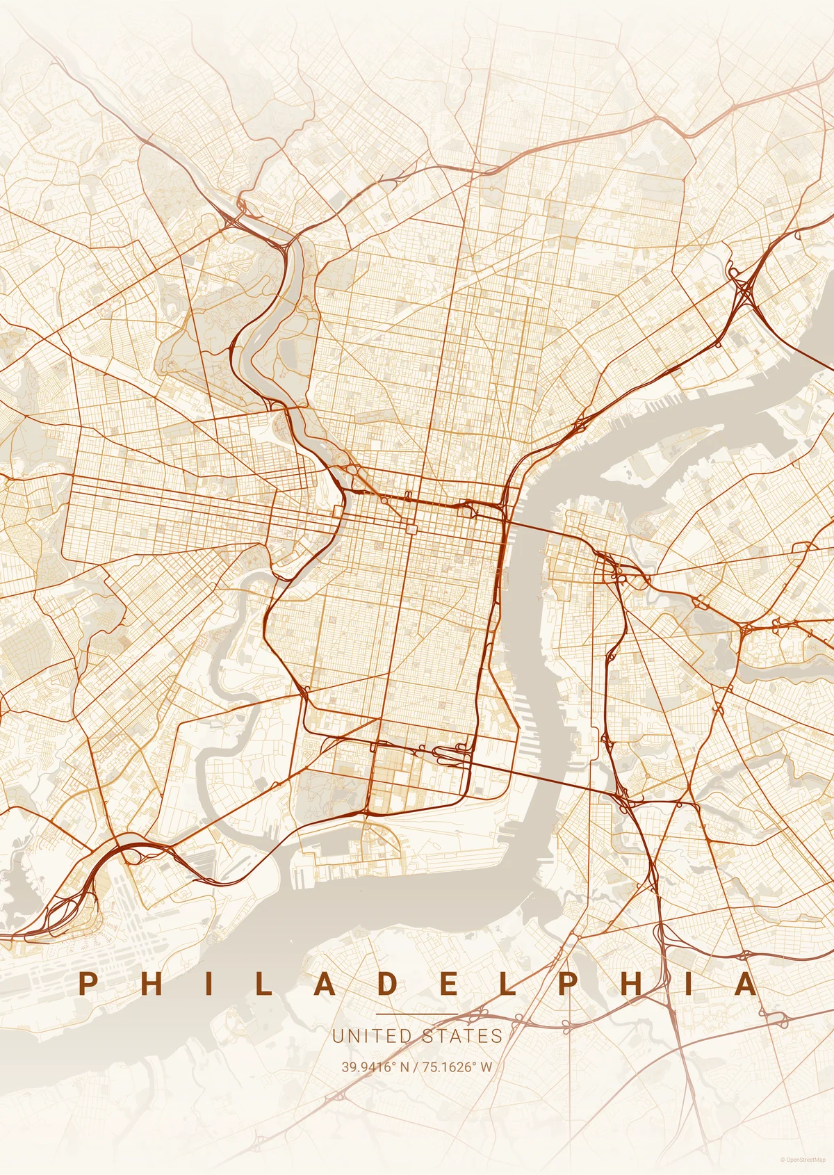
Choose the map mood that fits your space.

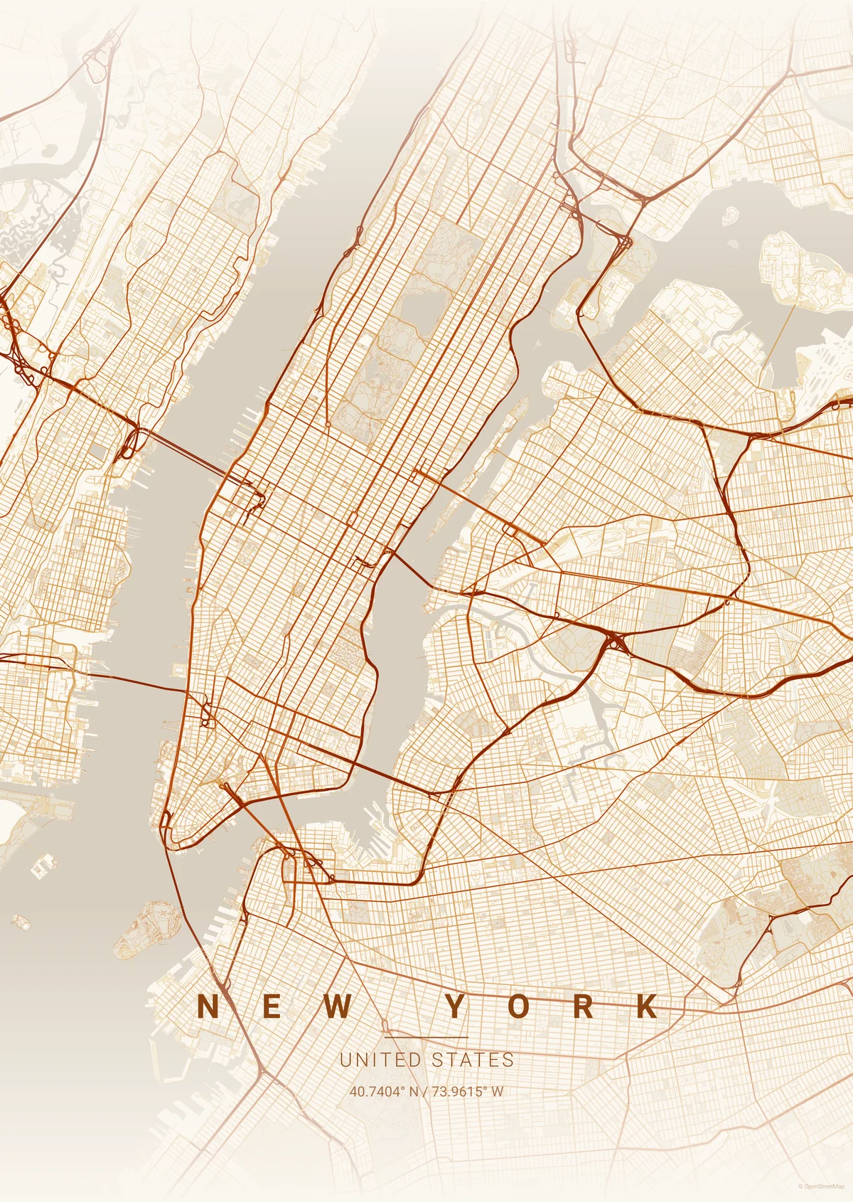
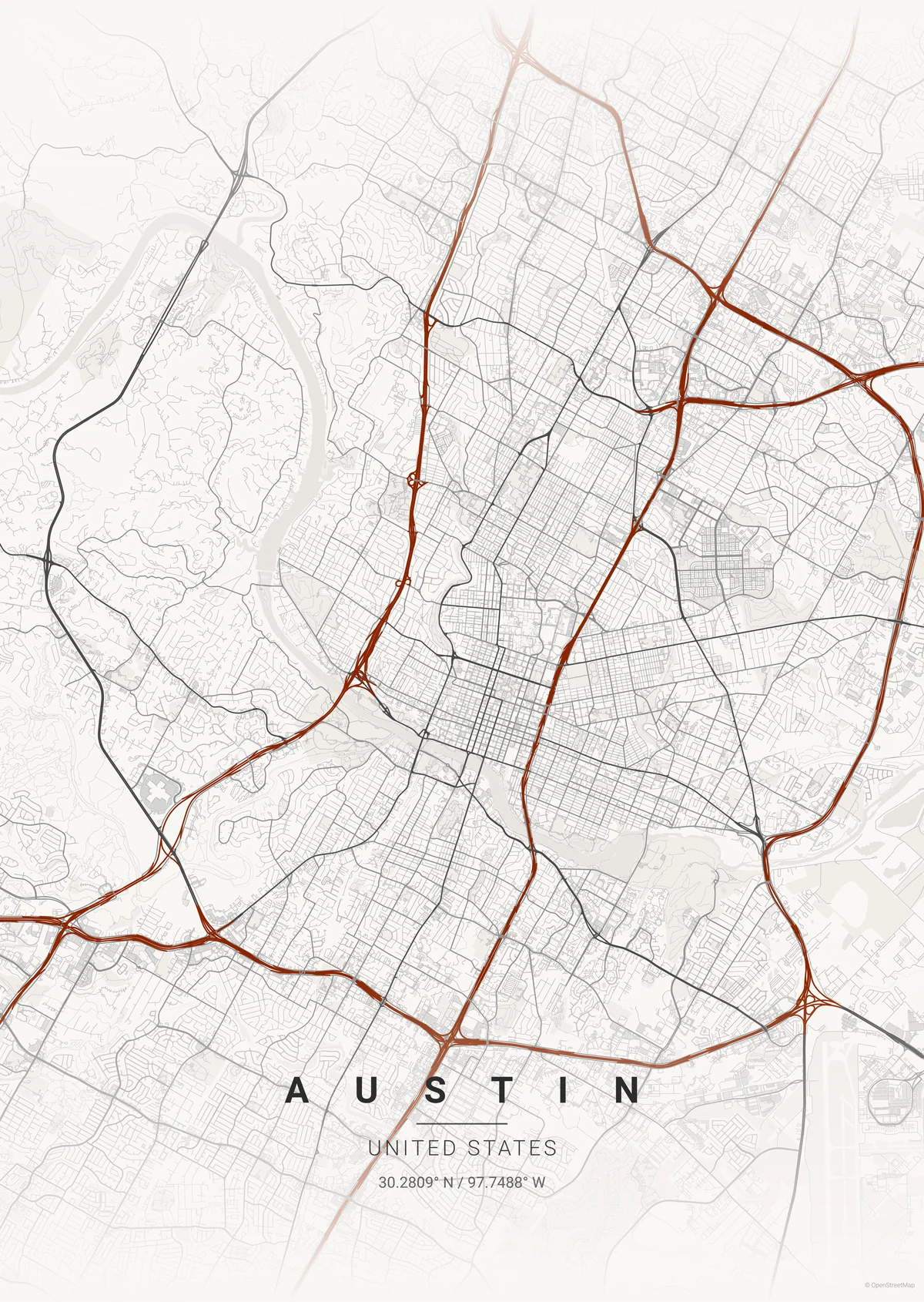
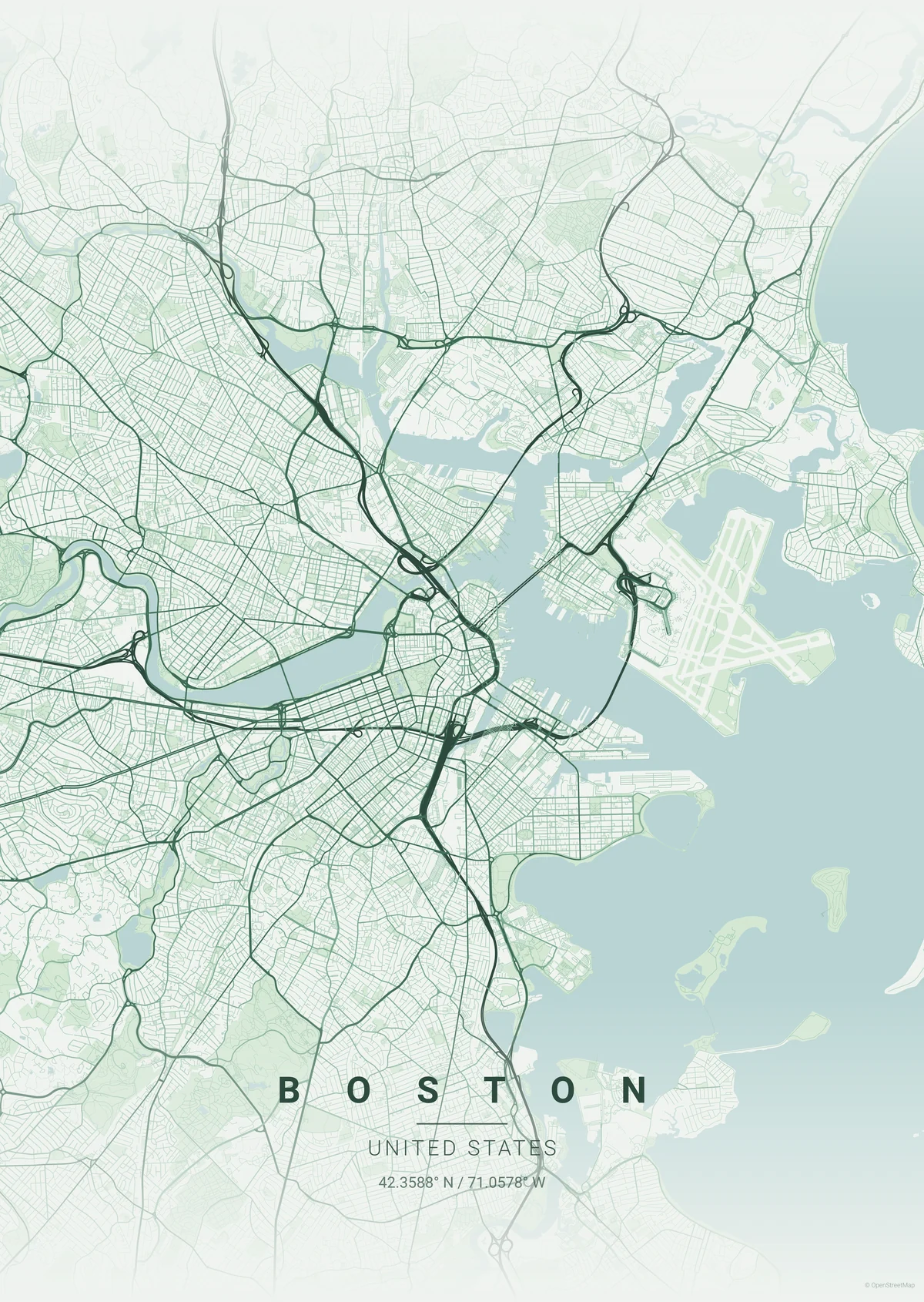
Every theme keeps the geography precise while changing the feeling of the print. Start with the room, then make the place yours.

FOREST NEW YORK
MONOCHROME SAN FRANCISCO
NIGHT LINES
Theme notes

Room first

Pick for the furniture, wall tone, and frame before the city label.

Readable detail

Roads, water, and neighborhoods stay legible across every direction.

Set friendly

Use one theme family across several places for a composed wall.

Designed
by place.
Styled by you.

More styles

Extra directions

When the room needs a stronger point of view.

Blueprint map poster style

Blueprint

Technical and crisp, with enough contrast to read from across a room.

Copper Patina map poster style

Copper Patina

A warmer urban treatment for homes with leather, walnut, and aged metal.

Noir map poster style

Noir

Dense, dramatic, and built for darker frames or a tighter gallery cluster.

How to choose
1

Match the room first

Choose a palette that already belongs with the wall color, frame finish, and furniture.

2

Let contrast set the distance

Sharper styles read fast from across the room. Softer styles reward a closer look.

3

Keep sets consistent

For multiple maps, repeat one theme family so the wall feels designed as a set.

Ready to see your place in one of these themes?

Create your map