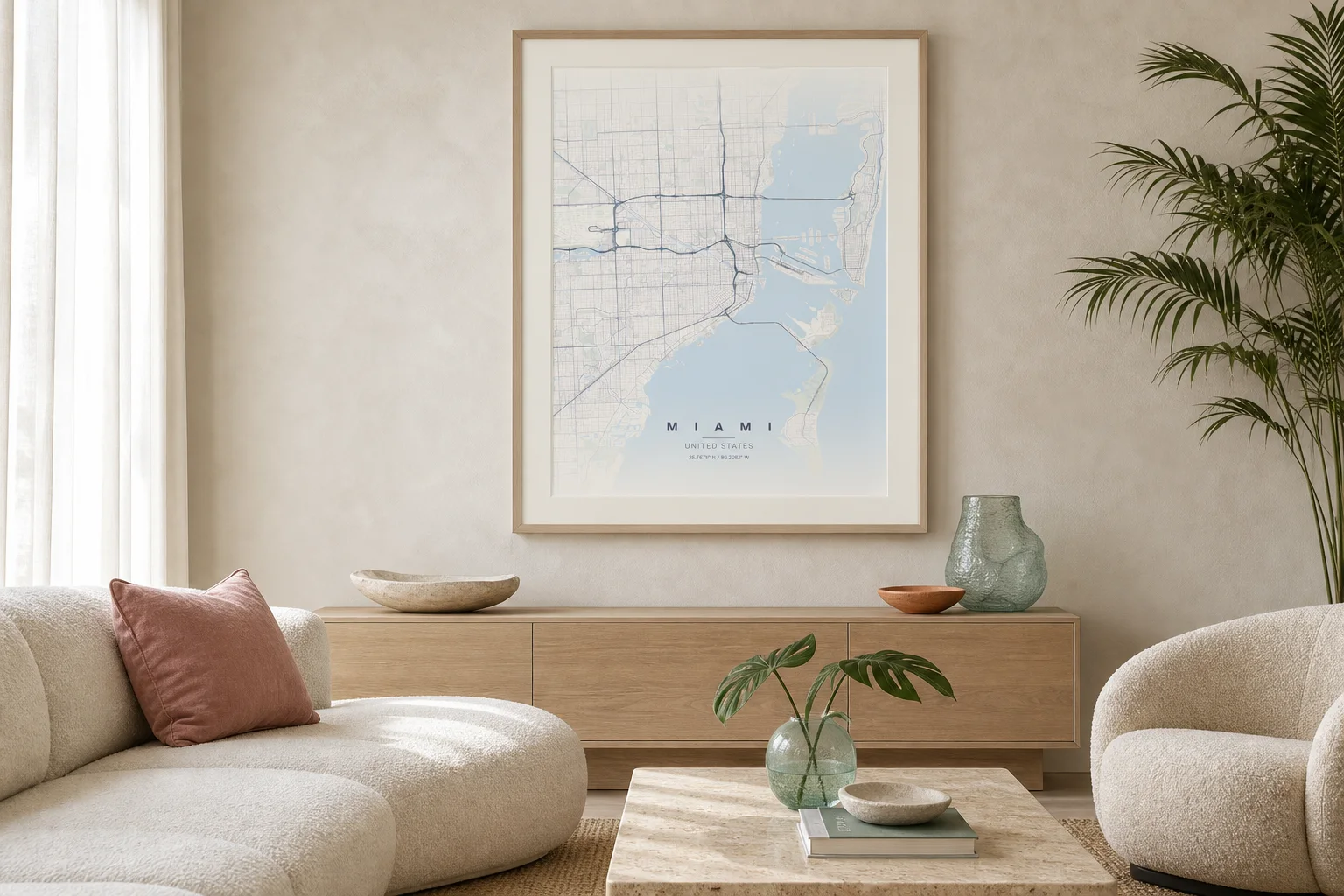
Bottom line: Start with the room’s fixed materials and light before choosing a map theme.
Why it works: The artwork can echo the interior without matching every color or disappearing into it.
Try this: Photograph the wall in daylight, identify one dominant neutral and one accent, then compare map themes against those two colors.
Wall art is often selected too late. The sofa, rug, stone, timber, and paint have already established a palette, and the remaining blank wall is treated like a separate problem. That is how an otherwise calm room ends up with a piece that feels disconnected.
A custom map makes the process easier because subject, color, crop, and typography can be considered together. The city provides meaning; the room provides the visual rules.
Read the permanent materials first
Begin with the finishes that are difficult or expensive to change: flooring, built-in timber, stone, wall color, and large upholstery. Decorative objects can move later.
In the Miami room above, the map does not copy the sofa. It picks up the pale blue water, soft cream ground, blush textile, and light oak frame. The result is connected without becoming a matching set.
Look for relationships rather than exact color matches:
- A warm beige map can sit comfortably with limestone, linen, and pale timber.
- Terracotta can bridge rust upholstery, walnut, brick, or warm plaster.
- Blueprint and monochrome blue can cool dark wood or sharpen a neutral office.
- Forest tones can settle a room with natural fibers and abundant greenery.
- Noir works best when the room already has enough light and a few dark anchors.
Give the map enough scale
A detailed city map needs physical size. If it is too small, the street network turns into texture and the title loses authority. Above a sideboard, aim for a frame that feels related to the furniture width rather than floating at the center of a large wall.
One substantial piece usually has more presence than several small maps unless the story genuinely calls for a series. Leave breathing room around the frame so the street pattern can remain the detailed element.
Use the frame to connect, not compete
The frame can repeat an architectural line or material already present. Pale oak softens a light room. Walnut adds depth to warm neutrals. Thin black metal can connect windows, lighting, or steel furniture.
A mat creates separation when the map palette is close to the wall color. Without a mat, a darker map can feel more immediate and graphic. Both choices work; the question is whether the room needs softness or definition.
Test the crop from the viewing distance
The map radius changes how the artwork feels. A broad city view reads as an abstract field from across the room. A neighborhood crop carries more specific streets but may feel busier.
Preview the map at roughly the size it will appear on the wall. Check it from the doorway and from the seat where it will be seen most often. If the title dominates and the geography disappears, increase the print size or simplify the road detail. If the map feels visually noisy, widen the radius or choose a quieter theme.
Personal meaning and visual discipline do not have to compete. Choose the place because it matters; choose the treatment because the room already knows what it needs.
Explore the available themes before finalizing the frame.