Bottom line: Make the two cities different in geography and identical in presentation.
Why it works: Matching scale, theme, typography, and frames turn distance into a composed pair rather than two unrelated posters.
Try this: Create both maps in the same session and compare them side by side before ordering either one.
Long-distance relationships are built through repeated small acts: a call kept despite a tired evening, a ticket booked months ahead, or an ordinary object sent across a border. A pair of city maps belongs in that same category. It is meaningful because it becomes part of the room, not because it announces the meaning loudly.
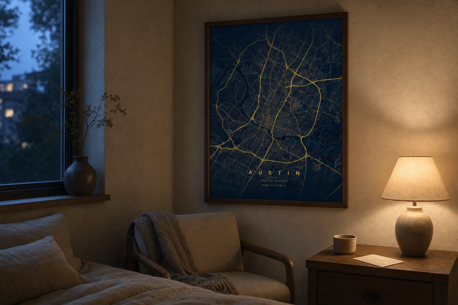
The Austin bedroom above shows one half of that idea: a map held in a quiet corner at dusk, close to the daily rhythm of the person who lives there. Its companion can live in another city and still share the same visual language.
Decide what the pair represents
The obvious choice is one map for each current city. That works well when the distance itself is the chapter being marked. Another option is to pair the two current cities with the place where the relationship began, creating a set of three.
Keep the story simple enough to understand without a paragraph printed on the poster. City name, country, coordinates, and a short subtitle can carry more weight than a long message.
Match the rules, not the street patterns
Two cities will never have the same visual density. One may be a tight grid beside water; the other may spread through hills. Do not force them to look identical by choosing mismatched zoom levels.
Instead, hold these decisions constant:
- print dimensions and orientation;
- theme and road-detail settings;
- title position and subtitle style;
- frame finish and mat width;
- approximate geographic scale.
When the presentation matches, the differences between the cities become the most interesting part of the pair.
Let each room influence the frame
Identical frames are satisfying when the pair will eventually hang together. If the maps will live apart for a long time, the frame can adapt to each room while the artwork stays consistent.
A midnight-blue map can sit in walnut in one home and black metal in another. The shared palette maintains the connection; the frame lets each person live with the piece naturally.
Plan for the wall that comes later
If closing the distance is part of the plan, decide how the maps might eventually hang together. A matched pair can sit side by side. Three maps can form a simple row with the meeting place at the center.
Do not leave a symbolic gap between frames unless it genuinely suits the room. The story is already present in the geography. Good spacing and alignment will say enough.
A map pairing cannot reduce the miles, but it can make both rooms feel connected to the same visual idea—and give the future shared home something ready to hang.
Create the first city map, then duplicate the design choices for the second.