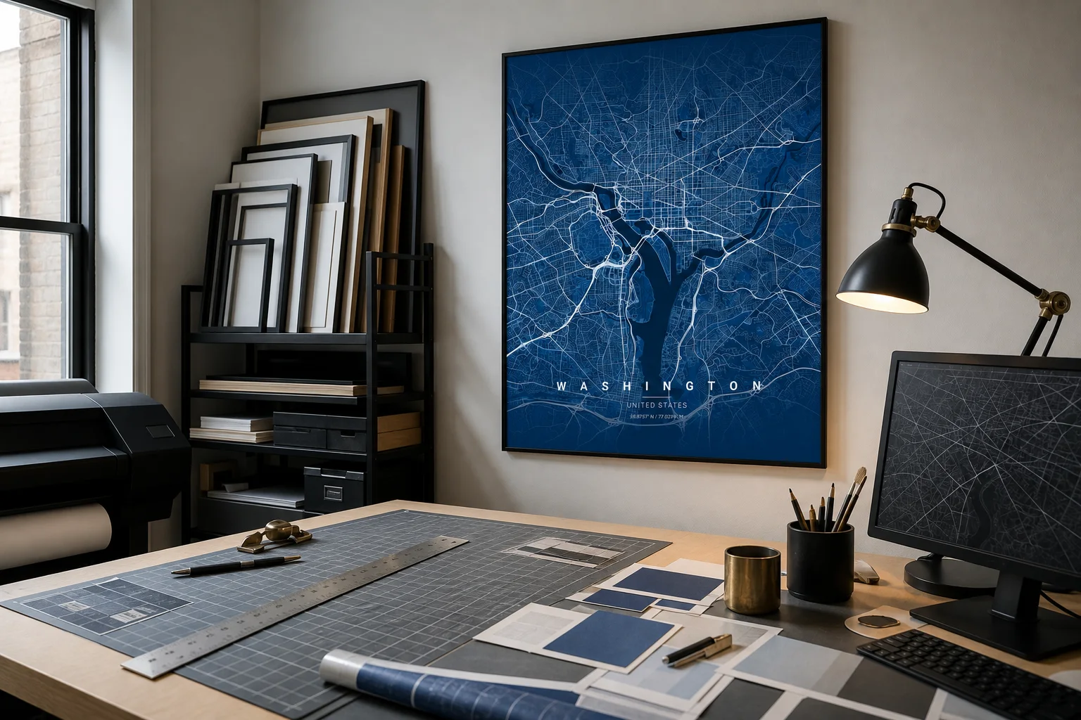
Bottom line: Compose the map for its final wall and print size, not just for the browser preview.
Why it works: Radius, road detail, text, theme, and aspect ratio are reviewed together before rendering.
Try this: Decide where the poster will hang and which print format you want before fine-tuning the map.
The Monotopo studio is a live composition tool. You begin with a place, but the useful work is deciding how much of that place belongs in the frame and how the map should behave in the room.
The Washington workroom above captures the spirit of the process: map data, material samples, print format, and frame finish considered as one design rather than a sequence of unrelated choices.
1. Find the anchor point
Search for a city or place, choose a suggestion, or move directly on the map. The selected point becomes the center of the composition, but it does not need to remain the visual center.
Pan the preview until the important geography feels balanced. A coastline may need more open water. A river city may read better when both banks are visible. A neighborhood poster may need the meaningful address slightly off-center so the surrounding streets have room.
2. Set the geographic scale
Radius determines the story. A broad radius shows the city’s overall shape, major roads, and natural edges. A tight radius makes local blocks and familiar routes more present.
Use city-border clipping when the administrative boundary is meaningful and available. Skip it when the visual story crosses that boundary or when the city’s organic shape is better shown through roads and water.
3. Edit the road hierarchy
Not every road class needs equal attention. The studio lets you tune motorways, trunk roads, primary and secondary roads, smaller streets, service roads, tracks, and paths.
Start with the major network, then add detail only until the place becomes recognizable. A dense city can become muddy if every minor road competes with the title. A suburban or trail-focused map may need smaller paths to carry the story.
4. Add only useful personalization
Set the city title, subtitle, coordinate line or short description, and any map pin. Keep the wording concise. The map already contains complexity; the typography should give it structure.
If a Strava activity or GPX route is part of the poster, load it before finalizing radius and road detail. The route may need more breathing room or stronger contrast than a city-only composition.
5. Choose theme and product together
Theme should respond to the room, while product size determines the poster’s aspect ratio. Choose the fulfillment region, product category, paper or finish, dimensions, and available frame color before the final render.
Changing format late can alter the crop. Review the full preview again after selecting the product, especially the space around titles, pins, coastlines, and route endpoints.
6. Render, review, then decide
The final render can be downloaded or kept in the saved map gallery. Look at the result at full size before continuing to print. Check spelling, coordinates, route placement, road density, and crop.
Small adjustments are the point of the studio. A poster becomes convincing through a few deliberate choices made while the whole composition is still visible.
Open the studio with the wall, room, and final format already in mind.